[Fading Advertisements] German Banks, Carpet Cleaners, Sandwiches, and Coca-Cola
An update to a sign from the book and a few new ones to add to the ongoing log that I still get interested in from time to time.
I enjoyed writing Fading Ads of Cincinnati. The subject of “ghost signs” (although I’m not a huge fan of the term) was something I wanted to cover here on QC/D for awhile. Like a lot of things, though, I had just never gotten around to it. Then a publisher, who’s generated similar books in others cities, stepped forward and asked me to do it. It was my second book, the first that featured any substantial writing, and an interesting experience. In the few years since the book’s release, I’ve held a tepid enthusiasm for fading ads. They’re interesting to me, but not an all-consuming passion. Researching them is usually difficult and time consuming, photographing them feels more documentarian than artful or expressive. I still come across new ones (at least new to me) everywhere and follow Bill’s blog as well as VisualLingual (they’re the OGs on this specific, local subject matter), but the vast majority of signs I’ve seen are contained between the covers of the book with only a handful more logged in the ongoing projects.
Here’s a few more. Maybe one day, if I ever find some time, I’ll get around to documenting the countless others I keep passing on my commute.
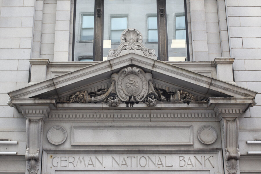
German National Bank Building:
At the corner of 4th and Vine in Downtown Cincinnati sits the German National Bank Building. Devoid of the common ethnic enclaves that many other major American cities came to have, Cincinnati’s strongest immigrant cultural identity is firmly tied to those of German descent (not that the history needs rehashing, the annual Oktoberfest and name of the “Over-The-Rhine” neighborhood speak for themselves). It’s not at all surprising that a bank named for the nation (presumably featuring bilingual, German speaking staff) existed here. In fact, this wasn’t even the only “German bank” in the city or even in the core.
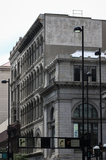
Apparently, the four-floor, beaux-arts style building was completed in 1905. It wasn’t long until World War One flared up and anti-German hysteria lead to a rebrand of the bank (much like how several of the city’s streets were renamed). The German National Bank became the Lincoln National Bank and was eventually swallowed up by local financial giant Fifth Third Bank. The iconic building at the heart of the city’s Central Business District remained and was repurposed over the years. Today it hosts a Starbucks and UPS shipping office with office space on the upper floors. Remnants of its origins are still visible: a stone inscription sits above one of the doorways and other lettering can be seen, partially covered up on another side.
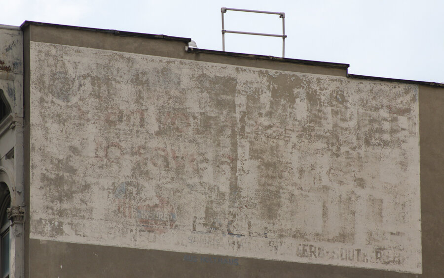
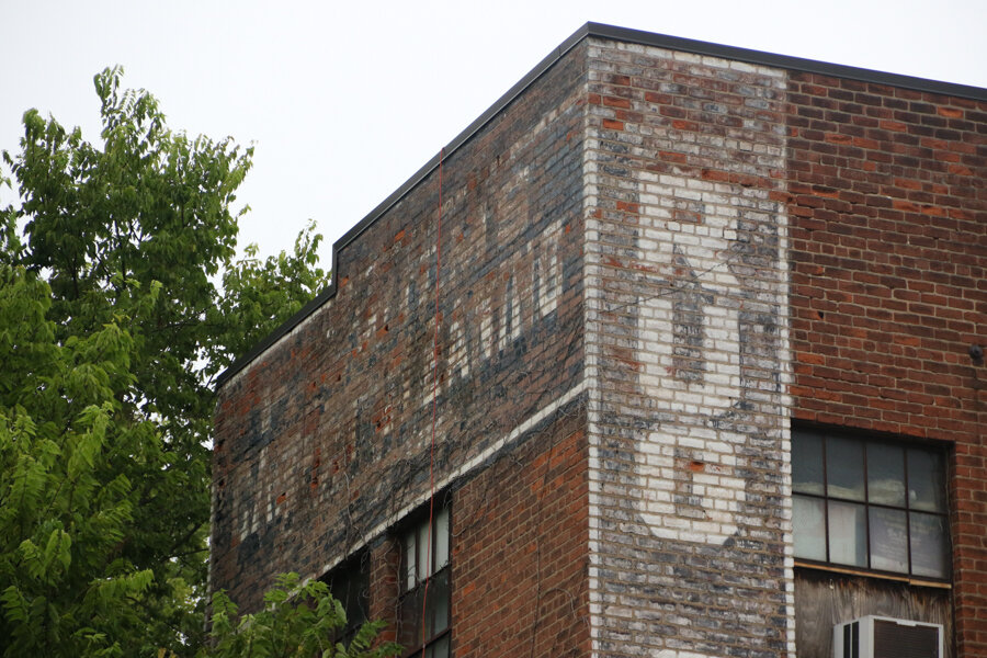
The principal ghost sign, though, sits above the building, facing the flow of traffic on 4th St. It’s actually on an entirely different structure and I’m only assuming it once related to the bank that once existed down below (both buildings were for sale in July 2018 per the Cincinnati Business Courier)
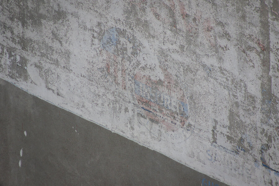
I’m just guessing here, but one detail in the old sign could’ve been a logo for the Federal Deposit Insurance Corporation, or, if not the official FDIC logo: a graphical representation that your money was safe in that building. There also appears to have once been another circular logo to the left, perhaps from a previous incarnation of the sign.
The coolest detail of the sign, though, is just below the white rectangle. It's the faded signature of Gus Holthaus, the man who was the city's most prominent sign painter.

If anyone has a historical photograph of W. 4th and Vine showing more of this sign, I’d love to see it. So far, I haven’t come across anything.
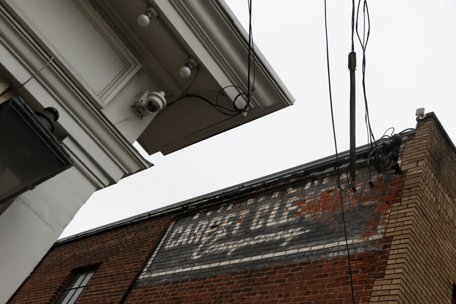
Carpet Cleaners:
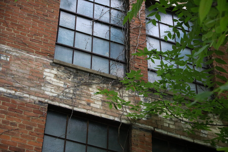
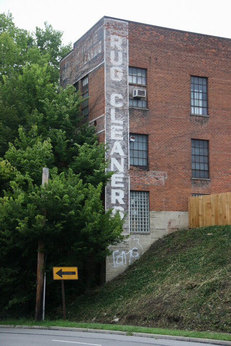
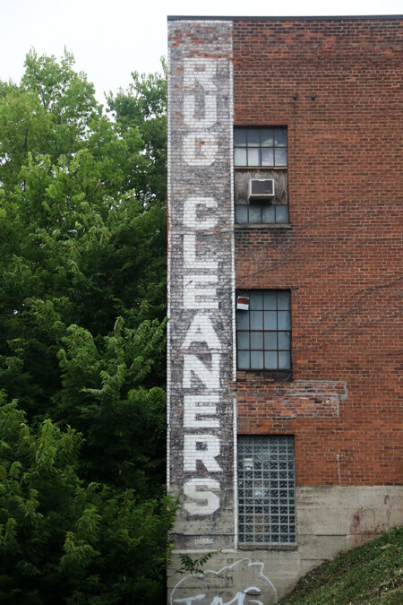
Another Gus Holthaus work that appeared in the book exists in the O’bryonville Business District (part of either the Evanston or O’bryonville neighborhood depending on who you talk to). Not to spoil anything, but the history behind this sign is pretty brief. Reading “carpet cleaners” and sitting on the side of a building near an alleyway that leads to a parking lot, a few electrical components/wires obscure the rest of the lettering: “F.H. Wilms." Per a historic directory, Wilms’ carpet cleaning and rug manufacturing company was headquartered in Downtown at one point, but per the remaining sign: it clearly had a neighborhood presence as well.
One of the things Bill once said to me, that I often remark about in the book, is that you always need to be “looking up.” That these signs are all around, like pieces of urban archeology. Some are obvious, some are subtle, some are passed by every day without so much as a glance. In the case of this carpet cleaning ghost sign: I saw it, but I had never seen all of it. That is, until one day while riding to work.
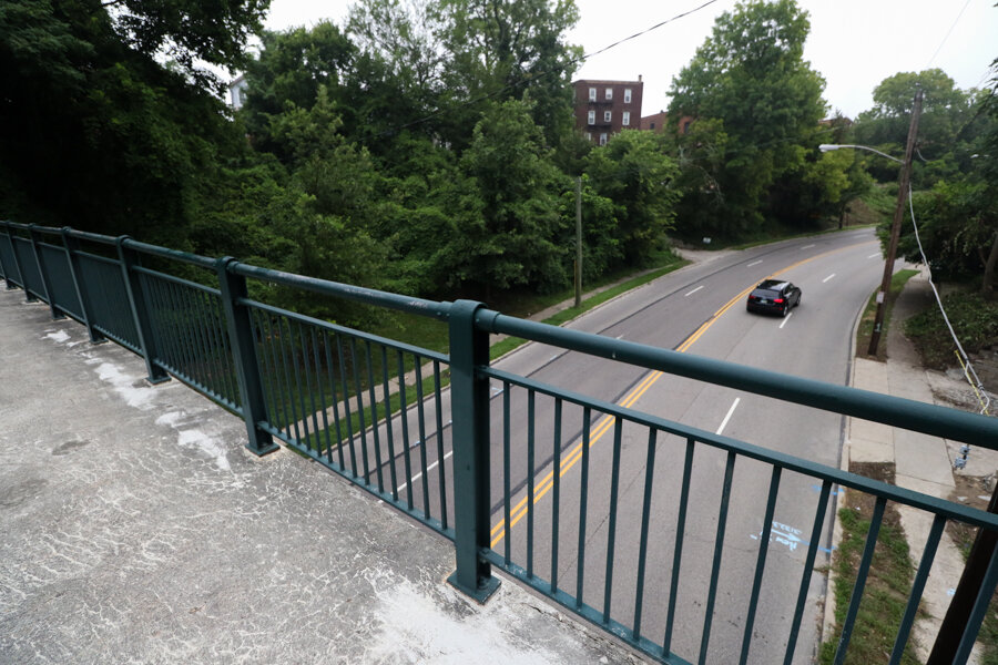
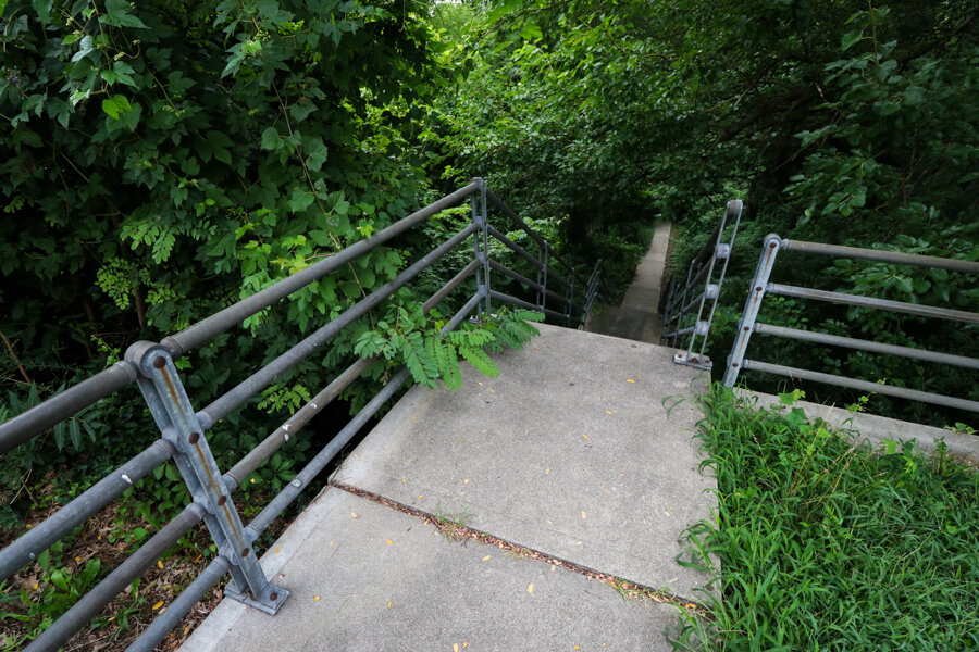
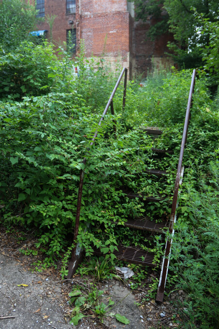
I had been passing by some curious hillside steps on my way to and from work for awhile. Finally one morning, I stopped, locking up the bike and heading down the steps into the woods. They led to a fairly modern pedestrian bridge (although, one almost engulfed in greenery) that crosses over a nearby street. Taking a moment to check it out, I noticed advertisements on a nearby building.
Walking up, they were still clear as day: “rug cleaners.”
A quick glance at Google Earth: yep, same building.
A quick look up: there was the name of F.H. Wilms again.
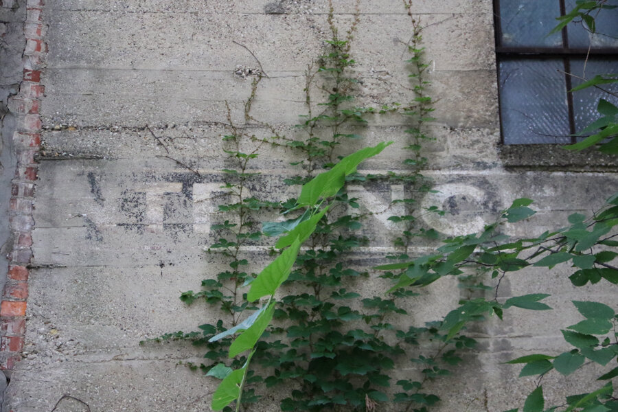
A quick look into the weeds: more letters, mostly indiscernible.
 |
| - The alleyway that runs alongside the building. |
 |
| - The original documented sign. |
The whole building had once been encased in advertising that mirrored the color scheme of the sign I had seen years earlier. This whole time, there was so much more.
The former carpet cleaning store is now a running/fitness outfit (formerly Bob Roncker’s), but I’m not sure if anyone’s making use of the warehouse out back. There is a nice little alley passageway, though, that connects you back up to the Main Street should you not opt for the hillside steps.
Sandwiches and Coca-Cola:
The final signs in this post come from Northside (thanks to QC/D reader Dennis for pointing this one out). I wrote it down as the “Park Chili Ghost Sign,” but per Dennis: he thinks this hand painted advertisement (at least what’s left of it) pre-dated the chili parlor.
I’ll admit, it took me awhile to see what Dennis was talking about. A physical, plastic, once illuminated sign reading “Park Chili” hung out front of the building, but I wasn’t seeing any faded, hand painted ghost signs. There was a splotch a different colored brick where something could’ve once been, but nothing was jumping out. Then, maybe because it was close to lunch, I saw a word: “sandwich.”
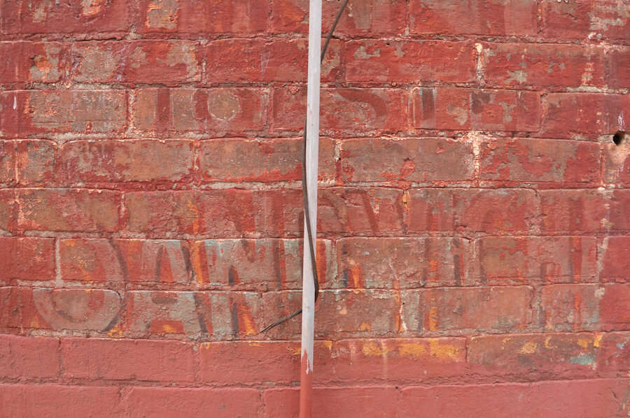
There’s no sandwiches or chili to be found here anymore, though. No matter who the sign was referencing, the Park Chili parlor had existed in this spot since 1937 after relocating from the Oakley neighborhood. In 2016, the business was sold and new owners pledged to keep the neighborhood diner open, but it appears to be gone now.
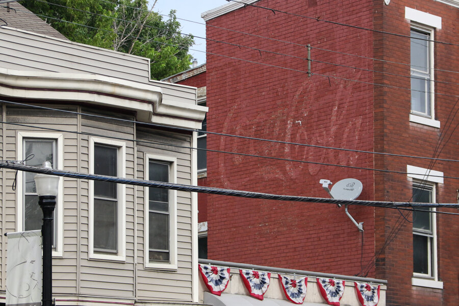
Turning directly around, there was another sign: a pretty blatant Coca-Cola logo, something not particularly uncommon in the landscape of fading advertisements. Nevertheless, still one I hadn’t seen yet.
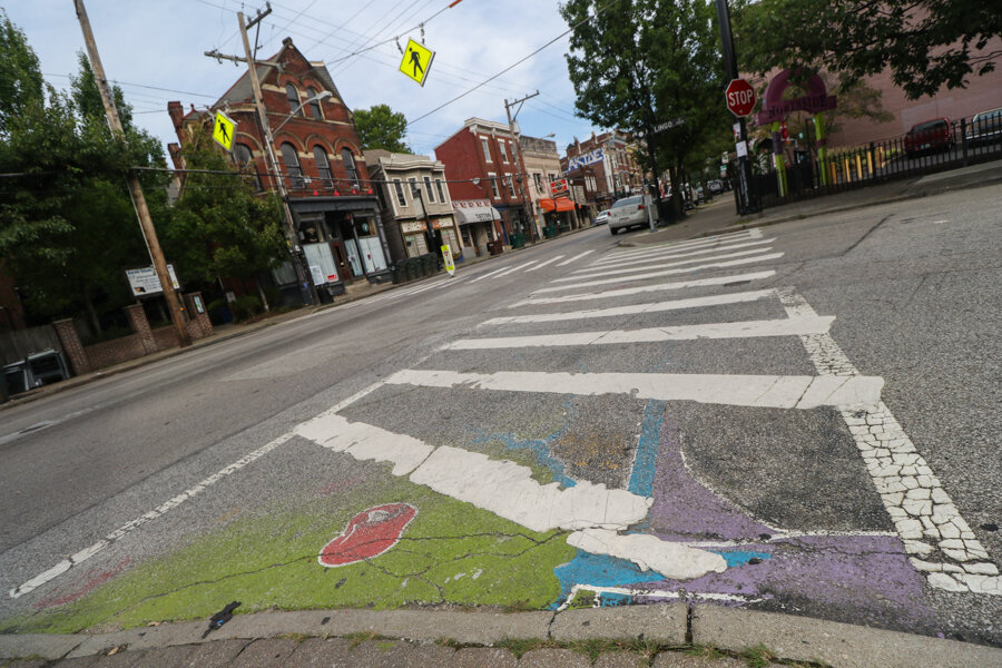
And in the street: no ghost sign, but the fading paint of once decorated crosswalk.
My book on the city’s fading advertisements is available here, other ghost sign posts are here.